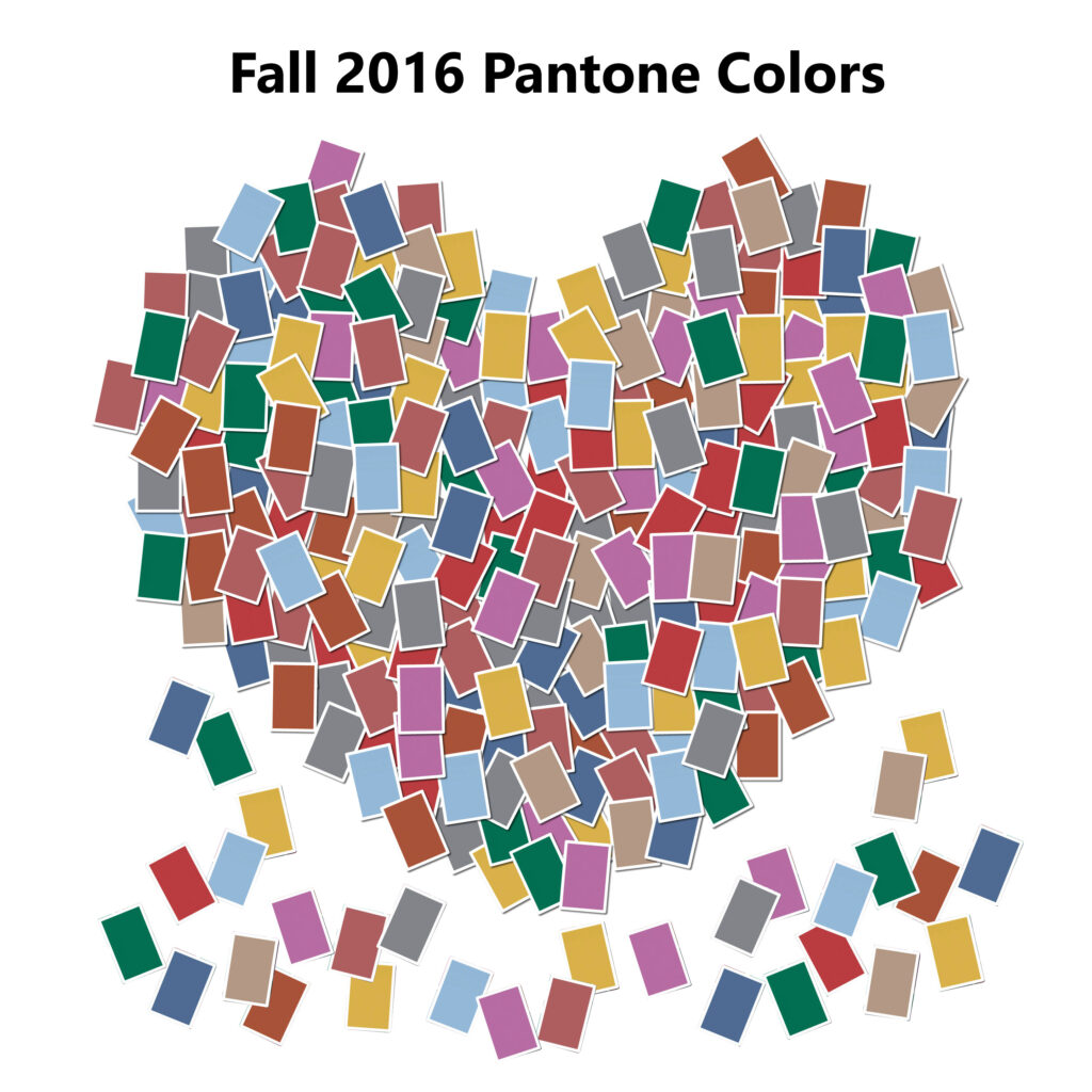
Fall is my absolute favorite time of year. Memphis is so hot in the summer that fall can’t get here fast enough. When the air turns crisp, I can layer on my blazers and put on my favorite boots! Have I mentioned yet that I am a blazer fanatic? So, you’ll here that a lot! And the colors for this fall are undeniably irresistible, so I am excited about the outfit possibilities.
According to the Pantone Color Institute, the colors were chosen as “a unity of strength, confidence and complexity.” The following colors are the Fall 2016 Pantone Colors of the Season and bring us endless color pairings.
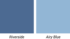 Riverside & Airy Blue: The strong and airy blues paired with beautiful neutrals and pops of color makes for a very delightful fall palette. These two blues will appear in more than half of the designs for Fall 2016. They are considered the leaders of the entire Fall 2016 palette.
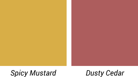 Dusty Cedar & Spicy Mustard: This color combo was shown on the runway of New York fashion Week and is one of my favorite but surprising color pairings. Every season there is a shade of pink chosen and this fall the Dusty Cedar is a warm dusty rose color that mixes nicely with the fall palette and softens it up a bit. The unique Spicy Mustard is a prettier and more wearable yellow than previous seasons. It is also lovely paired with most of the other vibrant colors in the palette.
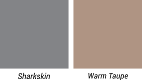 Sharkskin and Warm Taupe: Two of the neutral colors you will be wearing this fall. Sharkskin, a strong gray, will look amazing paired with any other color in the fall palette. Warm Taupe is also rich and soothing and is great paired with the bright and rich colors. These will be used to ground your outfits and make all the other colors stand out with brilliance.
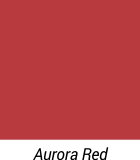 Aurora Red: A dreamy contrast to the blue leaders of the bunch. This is an adventuresome red that will look good on most skin tones, especially when paired with Sharkskin and Warm Taupe.
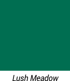 Lush Meadow: Calling all redheads, me included, this seasonal color is for you! Hopefully we will see lots of this color this fall. The Lush Meadow is a deep vibrant green that is sure to turn heads! It will look spectacular worn on it’s own or paired with the Blues, Spicy Mustard and any of the neutrals.
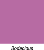 Bodacious: One of the unexpected springlike colors in the palette. It is a bright rich purple with hints of pink. Pair Bodacious with the pinks, reds and neutrals for a stunning fall look. This springlike color is uncommon for a fall palette but is very fitting with the mix of colors chosen for this season.
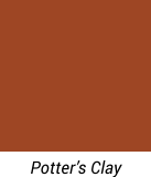 Potter’s Clay: Also a neutral color but has a lot more substance to it than the others. It is a rustic orange color that screams fall and will be appealing when used in rich leather for handbags, shoes and coats. It also mixes easily with most of the other colors in the palette. This is a great substitute for your unattractive brown.
These 10 colors are going to bring a very interesting and fresh fall palette. My favorites are going to be Riverside, Lush Meadow, Spicy Mustard and Dusty Cedar mixed with Sharkskin and Potter’s Clay. I hope you will get creative with using these colors in your outfits this fall. I know I will!


Comments are closed.